Until now, Google took into account the desktop version (for computers) of sites in order to apply its ranking criteria and rank pages in search results. If a search is done on a mobile and the site offers a mobile-friendly version, Google then displays a link to the mobile version of the page in its results.
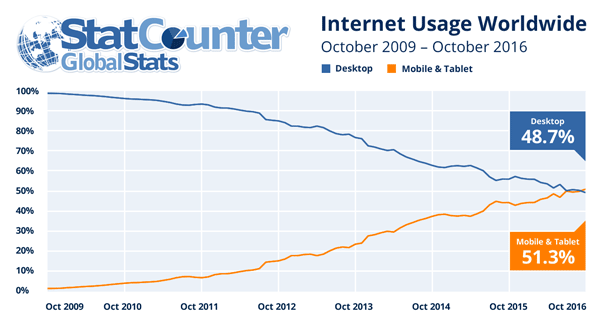
Since October 2016, the date on which, according to Statcounter, mobile and tablet traffic overtook desktop traffic, the aforementioned method of operating has become less relevant. For search engines, it is becoming more logical to take into account the mobile versions of pages to determine the rankings in search results.
N.B. in this article, the term mobile means smartphones, tablets are considered as computers (or desktop devices) by Google.
Other desktop/mobile comparative studies allow us to come to the conclusion that the mobile is the device that should be taken into account first, given the time spent on each device or the volume of queries on search engines. This has an impact on digital marketing in general, from website design to SEO, not forgetting digital advertising, etc.
What is the mobile-first index?
In simple terms, the index of a search engine is the data structure that references the content of web pages. We talk about mobile first as if there were two different indexes - one for mobiles and one for desktop - but in reality, the results for mobiles and desktop probably come from one index. Ranking factors will now come from the mobile version of the site; it's the desktop version that is becoming the "alternative", hence why we talk about "mobile-first".
When will we see mobile-first?
The change will not happen before 2018 at the earliest, even if Google has recently announced that some sites are already being tested, this migration is likely to be long and gradual.
For more information on mobile first: https://searchengineland.com/faq-google-mobile-first-index-262751
[Update 12/20/2017] John Mueller from Google recently said that you can see changes in your log files if you moved over to mobile-first: right now for most sites, crawling by GoogleBot is done around 80% by Googlebot desktop and 20% by Googlebot smartphone. If you see the reverse ratio, you probably moved over to mobile-first: https://www.seroundtable.com/google-log-files-mobile-first-indexing-24926.html.
Mobile technical SEO audit
Depending on the configuration of your mobile site, the implementation of a mobile SEO audit requires a specific approach. In any case, you need to analyse the mobile crawl data in order to detect possible problems and optimisations to be carried out, and launch a second desktop crawl in order to analyse the potential differences between the two versions: hextrakt can do this for you!
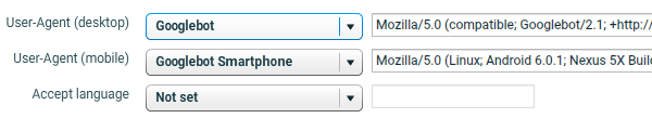
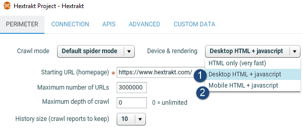
The mobile technical SEO audit starts with a crawl like Googlebot. It consists of crawling the site like Google does: the same user agent, of course, but also the same screen size and the same technology. Hextrakt embeds a Javascript web rendering engine based on the Chromium browser, the same one that Googlebot uses.
Before crawling, configure the googlebot user-agent in the "Advanced" tab:
There's nothing to stop you browsing on the main types of pages of the site, to do some manual checks to get an idea of what it's all about.
The different mobile configurations
Here are the three main configuration in order for pages of a website to be correctly displayed on devices with different screen sizes.
| Configuration | |||
| Mobile / desktop | Responsive design | Dynamic serving | Separate URLs |
| Same URLs? | Yes | Yes | No |
| Same HTML? | Yes | No | No |
| Advantages | Easy maintenance, less risk of errors | Mobile-friendly code, customisation | Mobile-friendly code, customisation |
| Disadvantages | Loading time, less customisation | Complex technical implementation, risk of errors, maintenance | URL mapping and redirects, maintenance |
For more information: https://developers.google.com/search/mobile-sites/mobile-seo/
1st case: audit of a responsive or dynamic serving site
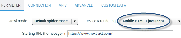
In these two configurations, the mobile/desktop URLs are identical. To configure Hextrakt for a specific audit of the mobile version of the site, the starting page is the site's homepage, and the "Device and rendering" setting to choose is "Mobile HTML + Javascript".
The mobile/desktop parity audit will be easier here: you'll only have to launch a second crawl with the same settings except the "Device and rendering" setting to choose: this time it is "Desktop HTML + Javascript". Hextrakt provides a detailed report on all the differences found between the two crawls.
2nd case: audit of a separate mobile site
The starting page of the crawl is the homepage of your mobile site (e.g.: http://m.mydomain.com). The configuration is the same as above.
The mobile/desktop parity audit will require the data from each crawl to be exported in order to be compared using Excel or openOffice, for example. To do this, click on the "EXPORT" button in the top right of the URL table then select "All data (bulk export)".
What should you check first in a mobile SEO audit?
Mobile compatibility
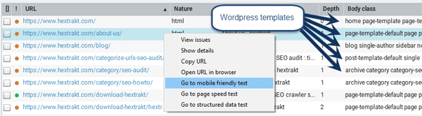
One of the first things to check is the correct mobile compatibility of the site's main templates, using the mobile-friendly test tool provided by Google. You can launch it from hextrakt by right-clicking on a URL for each template that you were able to identify (for that you can read our article on categorising URLs).
Usage data
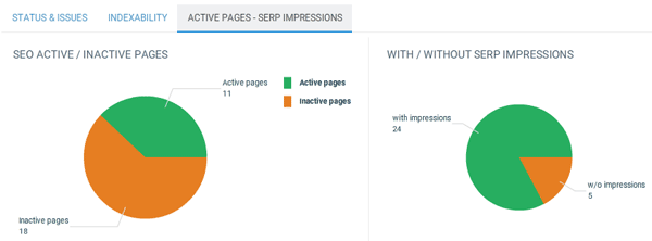
Use the analytics dashboard (menu Overview > Dashboard) to view the ratio of active pages (those that get visits from search engines) to inactive pages, as well as those that are displayed in search engines results pages (impressions).
The analytics reports show in particular pages that have no impressions in the search results. It may be useful to test whether these pages are indexed or not. Before launching the crawl, remember to configure the connection to Google Analytics and Search Console APIs in order to obtain this data.
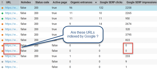
To create a custom report displaying the pages whose correct indexing must be checked by Google, use the URL explorer to isolate the indexable URLs. Choose the columns that you want to display and filter the URLs (Nature=HTML, NoIndex=false, status code=200, canonical not like “other”, “blocked by robots.txt” !=true). You can choose to display only pages that don't have any impressions by adding "Google SERP impressions" <1.
The report on orphan pages (known to Google but not found during the crawl) following a mobile crawl can highlight internal linking problems.
Check for errors in the Google Search Console. Does Google know the mobile version of the site, and is it crawled and indexed? The Search Console is a great help to quickly check some crawl and indexing problems.
Loading time
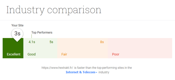
The loading time of mobile pages is a high-priority criterion to be included in optimisations as it has a big impact on SEO and the user experience. The longer it takes for a page to load, the more users will leave the site. You can see these correlations in Google Analytics by creating a custom report showing the bounce rates and loading times of pages (Avg. Document Interactive Time, Avg. Document Content Loaded Time...).
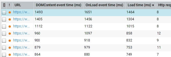
Quickly identify the pages that are slowest to load, those that have the most http requests, determine the correlations, etc.
In order to test the loading time of a site with a 3G connection, you can also test this tool.
There are many levers to optimise loading times before rushing to implement Google AMP pages.
Checking the directives
Everything that we check during a traditional technical audit, including onPage criteria (titles, content, etc.) must also be checked during a mobile audit, paying particular attention to error codes, redirects and directives, including canonical and alternate tags in the case of a separate mobile version of a site: one desktop page corresponds to one mobile page (not several) and vice-versa. The redirects between desktop and mobile versions also require in-depth verification: a desktop page must be redirected to the corresponding mobile page.
With the move to mobile first, will we have to reverse the alternate/canonical URLs for sites with a separate mobile version? Google replied no... To be continued...
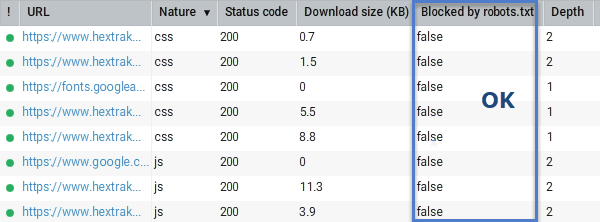
Check that the resources needed for the correct functioning and display of the mobile version (js, ccs, etc.) are not blocked for robots (robots.txt file).
Good practice
What doesn't work for the user experience also doesn't work for robots:
- loading time that is too long +++ (see above)
- inefficient or overly complicated browsing
- too many advertisements (do not use interstitials)
- unsuitable design (the mobile interface has its particularities)
Mobile vs desktop comparative SEO audit
A mobile vs. desktop parity audit is the best way to detect technical problems and to quickly and visually analyse the differences between the two versions. To do this, two successive crawls must be launched, a desktop one and a mobile one, so that hextrakt can compare them.
Remember to configure access to Google APIs in the APIs tab.
As seen above, Hextrakt analyses the crawl data and displays the differences detected for each URL, for responsive design websites, or those that use dynamic serving.
For a separate mobile site, the data for each crawl needs to be exported - "EXPORT" button at the top right of the URL table > "All data (bulk export)" - then you must match the URLs in a spreadsheet such as Excel in order to display the differences.
Mobile crawl vs desktop crawl
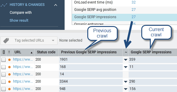
The crawl comparison function (menu "History and changes") allows you to display the differences found between two crawls. For each non-identical piece of data, hextrakt displays the data label and the number of errors found. This function, which is useful for tracking the progress of SEO projects and the implementation of corrections, also allows you to compare mobile and desktop crawl data.
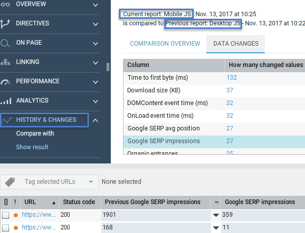
For each piece of data with different values, you can click on the number of differences to display each URL in the lower table, with the different values between the two crawls: the previous value vs the current value.